|
Florida’s Next Big Case

Michael David Dunn, 46, opened fire on a Dodge Durango with four teenagers inside after a dispute over their loud music at a Jacksonville, Florida gas station in November, according to Dunn's arrest report. Jordan Davis was the only one hit.
Dunn is White. Davis was Black.
Dunn claims he opened fire only after one of the teens threatened his life, brandished a gun, and started to exit the SUV. Later he told police that he had "never been so scared" in his life.
Circuit Judge Russell Healey granted a motion to delay the murder trial of Dunn, which was set to begin Sept. 23. A new date for the trial was not set, but Healey said he wanted it to occur sometime between mid-January and early February reported the Florida Times Union.
There are several differences between this case and the infamous Zimmerman says Mother Jones: there were several eyewitnesses to the Davis killing, including his three friends who survived, the police recovered no weapon, Dunn fled the scene with his girlfriend, and, police arrested Dunn the day after he killed Davis.
|
|
Affordable Care Act (ObamaCare) Marketplace is Open Now
The Kaiser Family Foundation has produced a tool that illustrates health insurance premiums and subsidies for people purchasing insurance on their own in new health insurance exchanges (or “Marketplaces”) created by the Affordable Care Act (ACA).
Middle-income people under age 65, who are not eligible for coverage through their employer, Medicaid, or Medicare, can NOW apply for tax credit subsidies available through state-based exchanges.
Also, you can use HealthCare.gov now to open an account and begin shopping for health care coverage. The site is in several languages besides English including: Chinese, French, French Creole,
German,
Gujaratl,
Hindi,
Korean,
Polish,
Portuguese,
Russian,
Spanish,
Tagalog and
Vietnamese.
|
|
|
 |
|
Advertisement

|
|
Things to Do

Jason Miccolo Johnson
Mysterioso:
Rhythm.
Movement.
Improvisation
Photography Exhibit
Washington, DC
Saturday Morning at the National (for children)
National Theater
1321 Pennsylvania Ave, NW
Sats Till Dec 14, 9:30a and 11a, free
Jason Miccolo Johnson
Mysterioso: Rhythm.Movement.Improvisation
Photography Exhibit
Anacostia Arts Center
1231 Good Hope Rd., SE
Fri, Oct 4, 6p-9p, free
Jason Miccolo Johnson
Mysterioso: Rhythm.Movement.Improvisation
Photography Exhibit
The B Spot
1123 Pennsylvania, SE
Sat, Oct 5, 4p-8p, free
Building Better Biking in DC (Bike Tour!)
Starting Point: Bike and Roll @ Old Post Office
Coalition for Smarter Growth
1100 Pennsylvania Avenue, NW
Sat, Oct 5, 10a-12:30p, free
Putting Women and Girls First
panel discussion: Report on the Intersection of HIV/AIDS,
Violence against Women and Girls, &
Gender-Related Health Disparities
US Department of Health, Great Hall
200 Independence, SW
Thu, Oct 10, 1:30p-3p, free
Reservations for entry
Putting and Golf Clinic – all ages
Henson Creek Golf Course
1641 Tucker Road
Fort Washington, MD
Sat, Oct 12, 10a-noon, free
Hockey Clinic – all ages
Tucker Road Ice Rink
1770 Tucker Road
Ft. Washington, MD
Sat, Oct 12, 10-noon, free
Health Screenings – ages 18 and up
Tucker Road Athletic Complex
1770 Tucker Road
Ft. Washington, MD
Sat, Oct 12, 10a-noon, free
Thomas Sankara Annual Conference
The Festival Center
1640 Columbia Road, NW
Sat, Oct 12, 3:30p- 8p, free
Jennifer Holiday
Us Helping Us
25th Anniversary Reception and
Awards Show
Arena Stage
Mon, Oct 14, $150
Baltimore
Baltimore Black Pride
Mon, Oct 7 – Sun, Oct, 13
Jacksonville, FL
3rd Annual Taste of Black Expo
EverBank Field Touchdown Club East
One EverBank Field Drive
Fri, Oct 4 from 7p-11p, $
Louisville, KY
Three Days of Greatness Film Festival
Muhammad Ali Center
144 N. Sixth Street
Wed, Oct 2 to Fri, Oct 4, free
West Reading, PA
Karibuni Festival
Penn Avenue
Thu, Oct 3, 1:30p –7:30p, free
|
|
The Sexual Freedom Summit was Thought-Provoking
The Woodhull Sexual Freedom Alliance held its annual summit in Silver Spring. The three-day summit included controversial workshops that expand the typical notion of freedom. Here is a synopsis of three of such thought provoking sessions.
Agency in a Land of Stereotypes: Re-imagining Authentic Black Female Sexualities
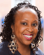
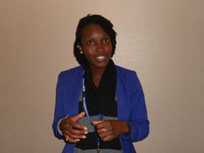
Legal Writer and feminist scholar Shaunee Morgan (pictured above) led a discussion on the images of Black female sexuality. Participant Trina Scot recalled growing up during the advent of BET videos and concluding, “I don’t want to be that.” She still feels that Essence magazine doesn’t represent her. Morgan asked participants to type in the words “Why are Black women “ in a web browser to see results such as: angry, loud, single, mean and better in bed.
Debunking the Legal Myths about Children in Polyamorous Families
Legal Consultant Dr. Elisabeth Sheff presented her findings after studying polyamorous families (families with multiple adults in a relationship) after a British Columbia, Canada judge ruled that children in such families are naturally harmed by the relationships. Sheff added that polyamorous families have problems but, “they are not definitionally exploitative or violent.”
With a little fun, she said when children of polyamorous families have to “closet” their home environment, they easily pretend to be from divorced families, which Sheff called, “serial monogamy” families. Sheff is the author of the upcoming book, The Polyamorists Next Door.
Non-Monogamous Relationships Roundtable
Social Psychologist Edward Fernandes and media spokesperson Anita Wagner Illig lead one of the summit's most provocative discussions that initially centered over labeling, including swinging versus polyamorous and the term polyfidelity (being committed in a relationship with several people.)
“The lines are not nearly as clear, there are swinging couples who raise kids and vacation together,” said one middle-aged swinger. Like any community, the swingers have rules. “Some come to swing bars thinking something will happen, no it’s a safe space where something may happen. If you want something to happen, you go and hire a sex worker,” said another.
Referring to the Showtime series Polyamory: Married & Dating, one man said polyamorous people are getting media recognition, but that the images are all White, young, and wealthy unlike himself, his White female companion of 13 years, who is in a heterosexual marriage, and the young Black woman they are both dating.
 Woodhull also awarded lesbian activists Mandy Carter (left) one of its Vickie Awards. Supporters of the conference included Glyde, which bills itself at the “the world’s first certified ethical, vegan and fair trade premium condom.” The next summit is August 7 to August 10, 2014 at that the Hilton Alexandria Mark Center in Alexandria, VA. Woodhull also awarded lesbian activists Mandy Carter (left) one of its Vickie Awards. Supporters of the conference included Glyde, which bills itself at the “the world’s first certified ethical, vegan and fair trade premium condom.” The next summit is August 7 to August 10, 2014 at that the Hilton Alexandria Mark Center in Alexandria, VA.
|
|
|
|
Mysterioso: Rhythm.Movement.Improvisation
 This photography exhibit, “is my most imaginative and highly anticipated work in ten years,” says Jason Miccolo Johnson. Johnson's latest exhibition, Mysterioso: Rhythm.
Movement. This photography exhibit, “is my most imaginative and highly anticipated work in ten years,” says Jason Miccolo Johnson. Johnson's latest exhibition, Mysterioso: Rhythm.
Movement.
Improvisation, is split between
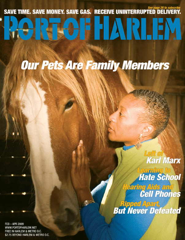
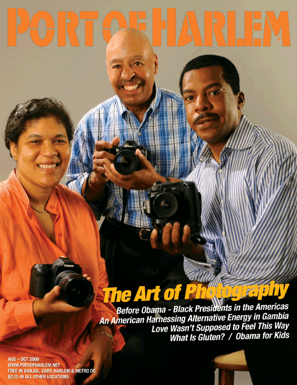
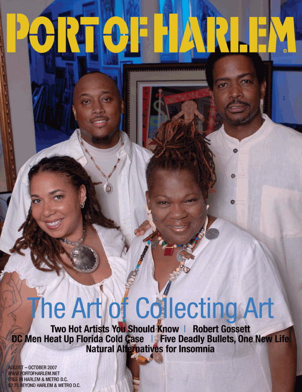
two venues and will show from October 4 - 30, 2013. “So you must go to both venues to see the entire collection,” added Johnson who shot three covers for Port Of Harlem. Johnson, who was the photographer for the POH covers displayed below, will also sale limited edition photographs from the exhibition. (click on the photo for the story and more photos by Johnson) |
|
The Most Popular Links from the last Snippets
|
|
|
|


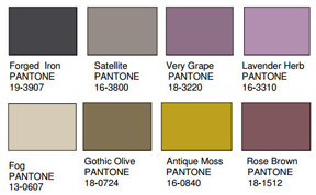
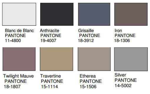
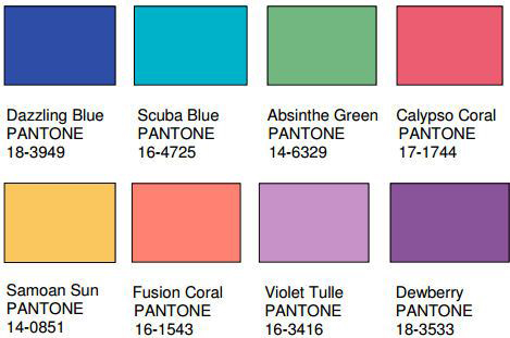
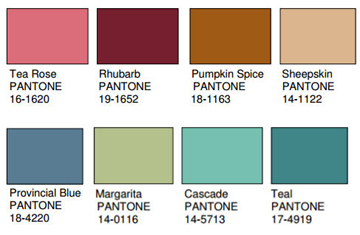
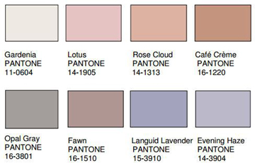
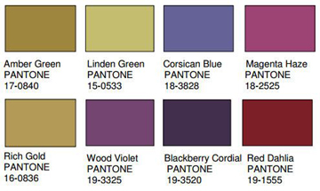
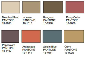
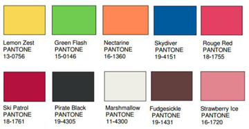
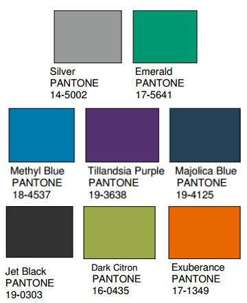 If you are looking for help with selecting the next paint color for your room, take a look at the color trends presented by Pantone for 2014. Every year, Pantone, the leading authority on color trends in the U.S., provides a home color design forecast for the coming year at the International Home and Housewares Show in Chicago. This year’s forecast is called Style and Substance and provides one the best interior color palettes that I have seen in a very long time.